UN adopts 2026 world map that finally shows Africa’s true size – why it matters
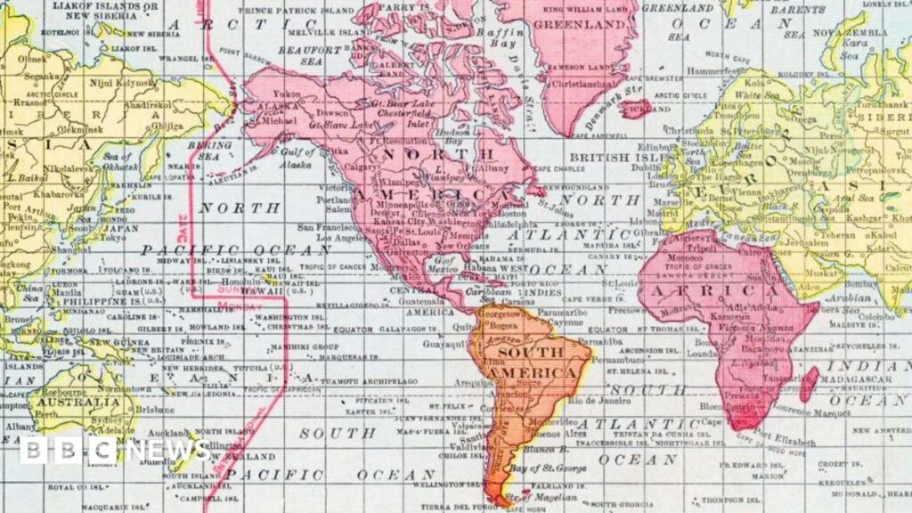
The UN’s New Africa‑Centric Projection – What Changed?
In March 2026 the United Nations unveiled a revised world map that uses the Gall–Peters equal‑area projection to display Africa at its actual geographic size, rather than the Eurocentric distortions of the familiar Mercator version. The redesign replaces the long‑standing map that has been standard in UN publications for decades, and it will appear in all official reports, conference backdrops and educational material distributed by the agency.
The Gall‑Peters projection stretches the horizontal axis and compresses the vertical, preserving area while sacrificing shape. In practice this means that the continent, which stretches from the Mediterranean to the Cape of Good Hope, now occupies roughly the same surface area on paper as Europe, South America and North America combined. The UN’s decision was driven by a formal resolution passed by the General Assembly, citing the need for “more accurate visual representation of all member states”.
Why Map Size Matters: Perception, Policy and Power
Maps are not neutral tools; they shape how people imagine the world. Studies by psychologists at the University of Oxford have shown that exposure to the Mercator map correlates with underestimation of Africa’s population and economic potential. When a continent looks smaller, it is often perceived as less significant, influencing everything from foreign aid allocations to tourism marketing.
Policy‑makers also rely on visual data when drafting trade agreements or climate‑change strategies. An accurate depiction of Africa’s landmass highlights the scale of its natural resources, agricultural zones and climate‑vulnerable regions. According to a 2025 report from the African Development Bank, misperceptions about the continent’s size have contributed to underinvestment in cross‑border infrastructure projects.
The new map therefore has the power to recalibrate narratives that have long favoured the Global North. By foregrounding Africa’s true scale, the UN is signalling a shift toward a more balanced visual language in international discourse.
Africa’s Response: From Schools to Start‑ups
Educators across the continent have welcomed the change. In Nigeria, the Ministry of Education announced that textbooks for primary and secondary schools will be updated by the start of the 2027 academic year to include the new projection. Teachers’ unions say the move will help students better understand geography and counter lingering colonial stereotypes.
Tech entrepreneurs see commercial opportunities as well. Nairobi‑based design studio MapMakers has already secured a contract to produce custom wall maps for co‑working spaces, featuring the UN’s equal‑area layout. The company estimates that demand for “accurate‑Africa” prints could grow by 40 % within the next two years, driven by diaspora communities seeking visual affirmation of their heritage.
Diaspora media outlets are also amplifying the story. A popular YouTube channel run by Ghanaian creator Ama Agyeman posted a viral explainer that compares the old and new maps, gathering over 2 million views in a week. Such grassroots amplification helps the map’s message reach audiences that traditional news wires often miss.
The Global Trend of Decolonising Cartography
The UN’s decision is part of a broader wave of decolonisation efforts in knowledge production. Earlier this year UNESCO released a set of world maps that centre the Global South, while several European schools have begun teaching students about map bias as part of their social‑studies curricula. Scholars argue that these initiatives challenge the legacy of colonial cartography that placed Europe at the centre of the world.
In the United States, a coalition of Indigenous groups successfully lobbied for the inclusion of Indigenous land‑use maps in federal environmental assessments. Similarly, the African Union is drafting a continent‑wide GIS framework that will standardise data collection using equal‑area projections, aiming to improve cross‑border disaster response.
These parallel movements suggest a growing consensus that visual representation matters as much as textual narratives in shaping power dynamics.
What the New Map Could Mean for African Economies
Accurate visualisation can translate into tangible economic benefits. International investors often use map‑based dashboards to assess market size and logistics routes. A map that correctly reflects Africa’s expanse may encourage more realistic modelling of supply‑chain costs, potentially lowering perceived risk for foreign direct investment.
Tourism boards are already re‑designing promotional material. South Africa’s national tourism authority released a poster series that juxtaposes the old Mercator view with the new Gall‑Peters image, emphasizing the continent’s “vastness and diversity”. Early feedback from travel agents indicates that the visual shift makes the destination appear more “grand” and worthy of longer itineraries.
Moreover, the map’s adoption by the UN could influence climate‑finance negotiations. Accurate area calculations are essential for carbon‑budget allocations under the Paris Agreement. African negotiators argue that the new projection will help them claim a fairer share of climate‑adaptation funds, as the visual evidence of large, vulnerable land areas becomes harder to ignore.
Looking Ahead: Adoption, Standards and Potential Pitfalls
The UN has set a 2027 deadline for all its agencies to transition to the new map, but implementation will vary. Some satellite‑imagery firms have warned that re‑calibrating their software to an equal‑area projection could incur significant costs, potentially delaying widespread digital adoption.
Critics caution that simply changing the visual representation does not automatically eradicate deep‑seated biases. Professor Kwame Mensah of the University of Cape Town notes that “maps are only one piece of the puzzle; without accompanying policy reforms, the impact may remain symbolic”.
Nevertheless, the momentum behind the change suggests that the map could become a lasting fixture in global visual culture. If schools, businesses and governments across Africa and the diaspora integrate the new projection, the continent’s true size may finally be recognised not just on paper, but in the decisions that shape its future.
Quick Answers
Why did the UN change its world map in 2026?
The UN adopted the Gall‑Peters equal‑area projection to show Africa at its real geographic size, aiming to correct longstanding visual distortions and promote more balanced representation of all member states.
How will the new map affect African schools?
Countries like Nigeria plan to update textbooks with the new projection by 2027, helping students learn accurate geography and challenge colonial stereotypes.
Can the new map influence foreign investment in Africa?
Yes; accurate area data can improve supply‑chain modelling and climate‑finance calculations, making the continent appear less risky and potentially attracting more investment.
Source: www.bbc.co.uk


💬 Comments 0